In years past, website design started with wireframes or visuals that focussed on a median screen size on a desktop display. Perhaps it was 1024x768 resolution. There's a lot more variation in screen sizes as mobile devices capable of displaying websites in rich accuracy have become prevalent. This means that our strategy for website design has to evolve from focussing on desktop displays with haphazard "fixes" in order for the pages to work on mobile, to beginning with a mobile first strategy. I'm going to walk you through mobile first strategy and its implementation within the Drupal CMS with this guide.
Drupal Mobile First Strategy
Mobile First Design means iterating a design with a start from the smallest target device screen size. Once the smallest screen size display is worked out, you move on to the next major target screen size and adjust your display as necessary to fit the new size. Perhaps your smallest screen size is a smartphone (though soon that may be a smartwatch). Most likely your design on a narrow smartphone won't incorporate columns of content. Instead, information that may usually reside in a sidebar would display before or after your primary content. Moving up to your second target screen size, perhaps a tablet, you may have enough space to incorporate an additional column. This layering can continue as more screen real-estate is afforded and your design alters to fit.
Drupal Mobile First Website Design Explained, Simply

Are you confused by Mobile First Strategy? Let me offer up an explanation that might be more easily digested.
The best visual description I've heard of this is to think of the different levels as stained glass. The bottom layer of stained glass would represent the mobile design. From there, you might add a tablet-based design - this second level of stained glass could have a slightly different design from the bottom layer. These design changes would naturally cover-up the bottom layer as the different colors and shapes within the stained glass would block out the light from hitting the bottom layer in the same way, producing a different result. Of course, some of the light would indeed make it through to the bottom layer which means the layers of stained glass would look different by themselves, but also when stacked.
This stacking process would continue onto each new layer, showing different designs through and all based upon eachother.
Drupal Responsive Design
A key part of a mobile first strategy, from a technical point of view, is the use of responsive website design. This is the process by which code read by the browser detects screen sizes and adjusts layouts to match a particular screen size. In technical terms, this is done through the concept of media queries. Media queries are cascading style sheet (CSS) code which is able to detect a pre-set screen width and then apply encapsulated code which only runs at that particular size or larger (or smaller).
Adaptive Design vs. Responsive Design
Responsive design principles also dictate that the design should constantly respond to varying screen sizes. That means that your "tablet" target design should work with a variety of screen sizes close to a single target size. This is because there's variety in device category screen sizes; not all tablets have the same screen size. Design code which dictates static layouts based on singular screen size breakpoints is known as Adaptive Design and is less flexible (though less complex) than Responsive Design.
A History Mobile Websites
Before responsive (and adaptive) design concepts were widely accepted, systems were in place to detect literal mobile devices (as opposed to screen sizes) and adjust design based on which devices was accessing the website. As you might imagine, as more and more mobile products have come into existence, this was not a scalable approach. It was unreasonable to constantly update mobile device detection methods whenever a new device became popular. An approach of adjusting design based on screen sizes was far more practical.
Prior to having device detection available as a mobile web design strategy, separate mobile websites were the primary method to dealing with mobile users. You may recall seeing redirects to mobile subdomains (http://m.domain.com for example). This method utilized an almost entirely separate website that was displayed to mobile users. An separate theme or template would need to be maintained and sometimes even separate (or duplicate) copies of content.
Drupal Mobile First Design Strategy for Websites
I'm a huge fan of the HTML5 Boilerplate, a generic frontend web framework. It's an amazing tool for starting out new web projects, as we've become more involved with Drupal, I set out to find a solid theme that would support a lot of the same principles and function well with Drupal. Our primary Drupal projects are all in version 7, so we've limited our theme reviewing and process development to Drupal 7.
Pitfalls in Drupal Mobile Themes
A primary concern we have for utilizing Drupal 7 themes is following a mobile first design approach. This means that we want base themes that follow a principle of adding larger "layers" of screen sizes with appropriate design adjustments atop the initial smallest screen size target. What we don't want is the reverse: themes which focus on removing elements from desktop designs and overriding desktop designs to fit small screens.
Recommended Drupal 7 Mobile Themes and Templates
We've used several different Drupal 7 themes here at Daymuse. Each provide varying degrees of mobile support. These include:
- Adaptive Theme
- Aurora
- Bootstrap
- Foundation
- Omega
- Radix
- Zen
Each has their advantages and disadvantages. I recommend using this as a starting point to look further into the use cases for each theme. For example, Bootstrap is a fantastic theme (based on a fantastic framework) to quickly build out a rich design but has somewhat limited variation; it's more assembling pieces than an open landscape.
Our Favorite Mobile First supporting Drupal Theme
We tend to build client sites that start from a literal blank page, and for that we greatly prefer the Omega theme as a basis of our projects. It's similar in nature to the HTML5 Boilerplate frontend framework I mentioned earlier. When you first install Omega, you'll be greeted by a fully reset design: white background, default text. The styling resets provided by Omega mean that you'll be working from the same blank slate across all browsers; there shouldn't be variation in element styles. In addition, the CSS is setup to follow mobile first design principles: build the small screen design first, add additional layers of design alterations for each additional breakpoint. Omega incorporates responsive design as part of its core purpose.
Mobile Design in Drupal Administration

Generally when discussing mobile first design strategy for Drupal, we're referring to what the end user sees. Drupal sites actually utilize two separate themes: and end user theme that anonymous website visitors see through the Content Delivery Application portion of Drupal and an administration theme which logged in users typically see with the Content Management Application side of Drupal.
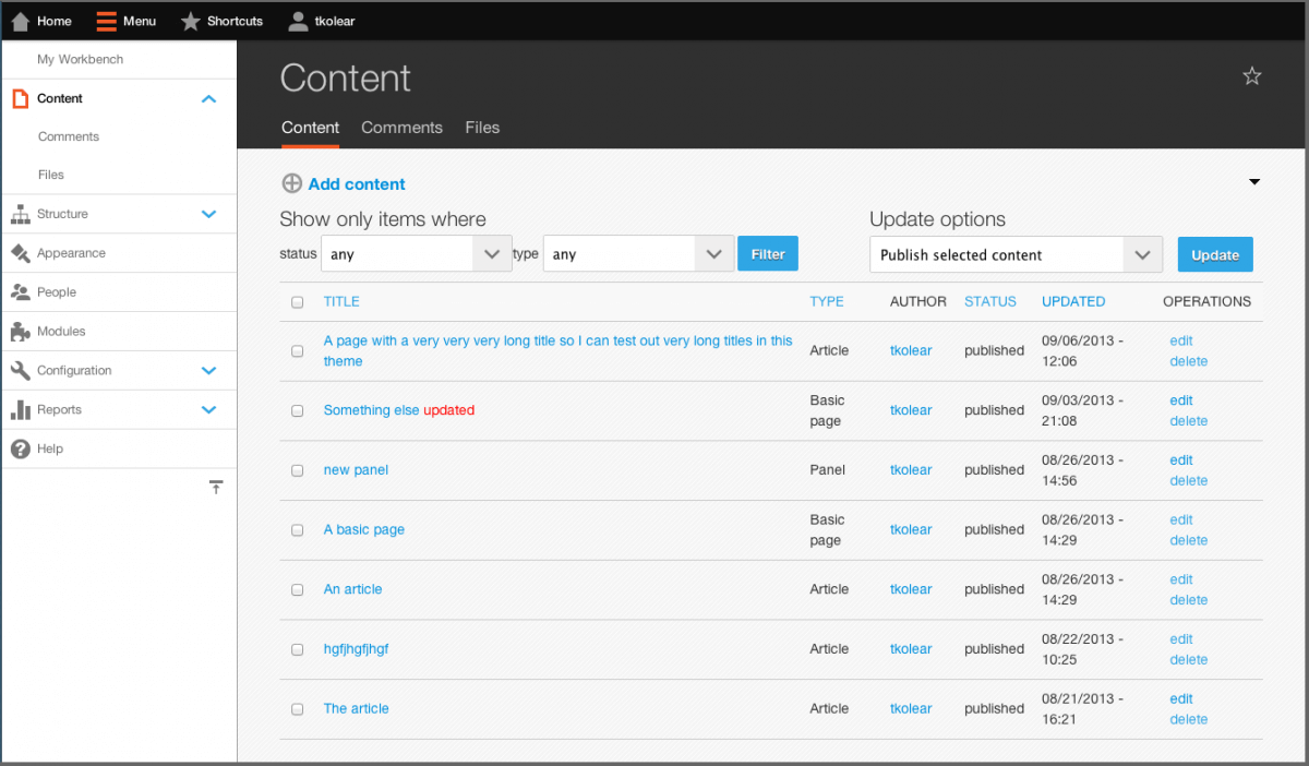
While our primary focus is in the end user experience, there's also concern for the administration side and mobile first design. Just like the end user theme, Drupal's administration themes are fully customizable and can be built from the ground-up using mobile first design principles. Typically, we utilize off the shelf Drupal administration themes as our clients find the administration interface to be secondary. We love using the Ember mobile-friendly administration theme with Drupal 7. Ember works perfectly alongside the Mobile Navbar menu module. Ember & Navbar mobile menu are some of our favorite mobile tools for Drupal. These two Drupal modules create a perfect starting point for mobile-friendly Drupal 7 administration. Even better, they follow the direction of Drupal 8—making it easier for your users to migrate to Drupal 8 in the future.
Drupal Mobile-Friendly Testing Tools
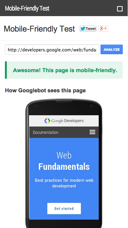
As of April, 2015, Google is placing and even greater emphasis on websites' mobile-friendliness. If your users are on a mobile device and searching Google, they're more likely find results which Google deems to be "mobile-friendly". There's several criteria to meeting this test, but follow best practices as outlined above with your Drupal site and basing it on a recommend Drupal mobile theme should have your site pass the test.

The Mobile-Friendly Test is a free tool offered by Google. Before you launch your site, be sure it meets the requirements to be mobile-friendly. Having a mobile-friendly Drupal site is one of the easiest ways to surpass your competitors who do not have sites which meet Google's mobile-friendly requirements in search results.
If you like this guide to mobile first strategy and responsive design with Drupal, consider sharing it. Ping us if you have questions, corrections, or think something should be included—we respond quickly!
If you or your company are seeking expert direction with incorporating a mobile first strategy or responsive design into your projects, we can help. Catch us on Twitter or other networks to connect with us.